

What are Candlestick Charts & How to Read Them?

A candlestick chart graphically represents a share/stock’s price and volume data. They help us visualise the price movement, making it easier to understand and analyse. In the past, traders had to constantly monitor the screen for hours and try to memorise significant price levels, which was practically impossible. Thankfully, the introduction of candlestick charts revolutionised how we interpret market data.
In this article, we will learn how to read candlestick charts, the types of candlesticks, and a few candlestick patterns.
What is a Candlestick Chart?
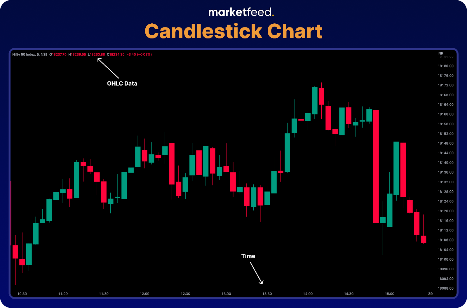
A candlestick chart is a type of price chart that displays four prices per data point. It shows the opening and closing prices and the high and low prices during a period. These price points are known as the OHLC data in short, which stands for Open, High, Low, and Close, respectively. Furthermore, a candlestick chart also portrays the emotions of the investors and traders.
Candlestick charts originated in Japan, where technical analysis has been in use for centuries. A Japanese rice trader, Homma Munehisa, developed a system of charting price movements using candlestick patterns and observations of market psychology. His work laid the foundation for candlestick charting methods.
Structure of Candlesticks
A candlestick chart is a collection of candlesticks. There are two types of candlesticks based on whether the price increases or decreases. They are bullish (green) and bearish (red) candles. A candlestick has three parts that depict four prices:
- The central real body - It is a rectangular shape that connects the opening and closing prices.
- Upper shadow - Indicates the high
- Lower shadow - Indicates the low
The four price points are:
- Open - The price at which the asset started trading in the timeframe.
- High - The highest price at which the asset got traded.
- Low - The lowest price at which the asset got traded.
- Close - The price at which the asset got traded at the end of the time frame. The Last Traded Price (LTP) of the timeframe will be the closing price.
Both bullish and bearish candles have OHLC price points. However, the position of opening and closing prices in both are different.

If the closing price is higher than the opening price, it is known as a Bullish or green candle. On the other hand, If the closing price is lower than the opening price, it is known as a Bearish or red candle. A green or bullish candle symbolises buying, while a red or bearish candle symbolises selling. Next, let’s look at some basic candlestick charts!
Basic Candlestick Patterns
1. Bullish and Bearish Engulfing Patterns
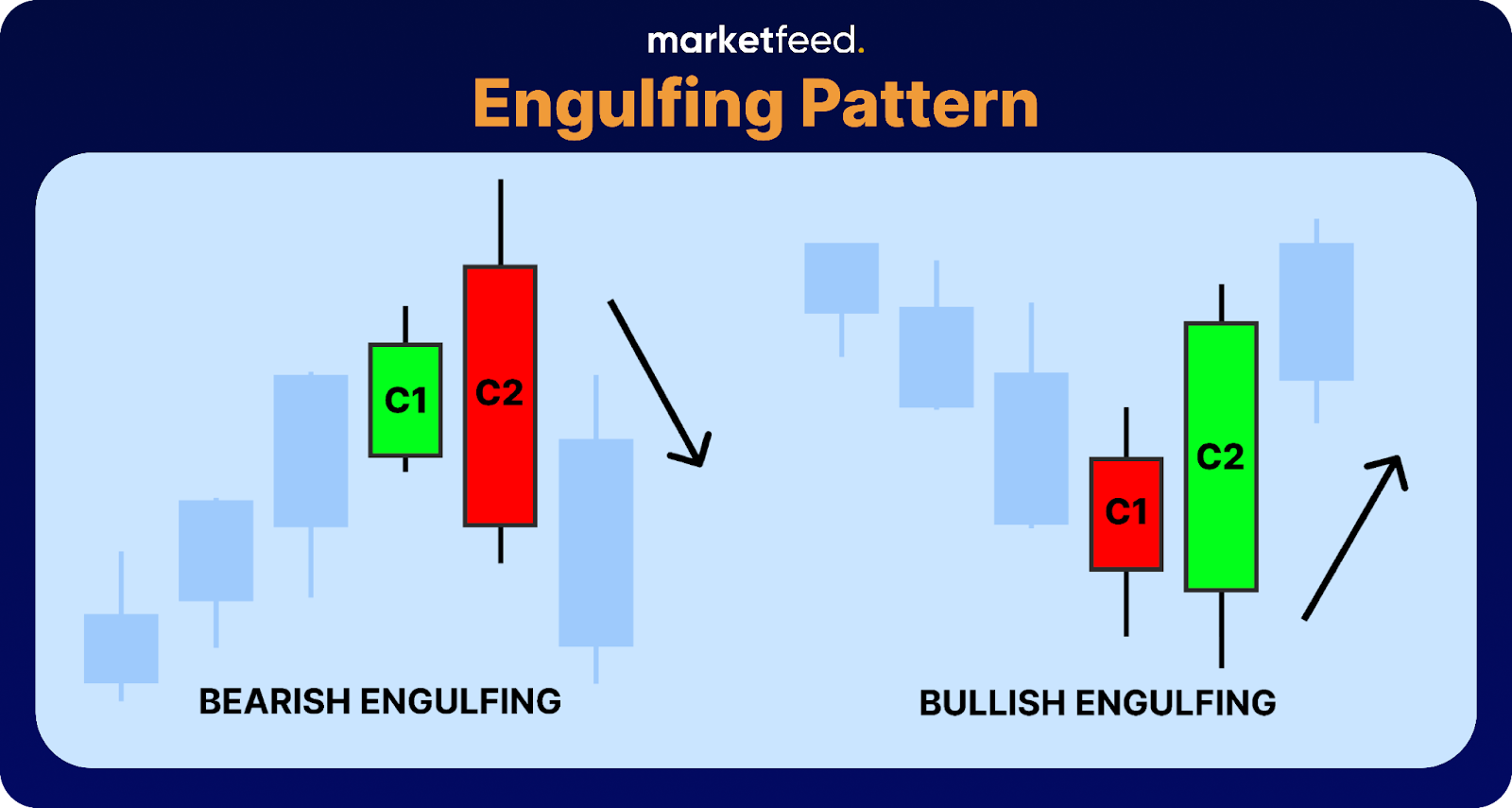
A bearish engulfing candlestick pattern occurs during an uptrend and consists of two candles. The first candle is a bullish (green) candle, followed by a larger bearish (red) candle that completely engulfs or covers the previous candle's range. This pattern suggests that selling pressure has increased, overpowering the previous buying momentum, and indicates a potential shift toward a downward trend. Traders often interpret a bearish engulfing pattern as a bearish signal.
On the other hand, a bullish engulfing pattern occurs during a downtrend. It also consists of two candles, but in the opposite configuration. The first candle is a bearish (downward) candle, followed by a larger bullish (upward) candle that completely engulfs the previous candle's range. This pattern suggests that buying pressure has increased, overpowering the previous selling momentum, and indicates a potential shift toward an upward trend. Traders often interpret a bullish engulfing pattern as a bullish signal.
2. Bullish and Bearish Harami Patterns
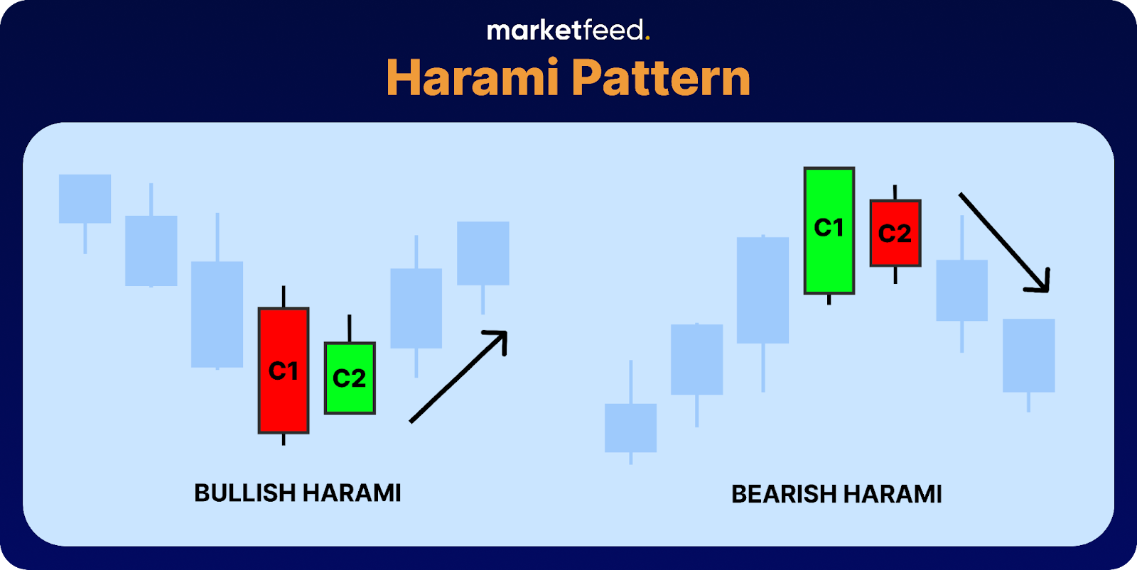
A bullish harami pattern consists of two candles. The first candle is a large bearish (red) one, indicating a prevailing downtrend. The second candle is a smaller bullish (green) candle that is completely engulfed or covered by the body of the first candle. This pattern suggests that selling pressure may be weakening, and a potential trend reversal towards an upward move could occur. Traders often interpret the bullish harami as a bullish signal.
On the other hand, a bearish harami pattern also consists of two candles. The first candle is a large bullish (green) candle, indicating a prevailing uptrend. The second candle is a smaller bearish (red) candle that is completely engulfed by the body of the first candle. This pattern suggests that buying pressure may be diminishing, and a potential trend reversal toward a downward move could occur. Traders often interpret the bearish harami as a bearish signal.
3. Morning & Evening Star Patterns
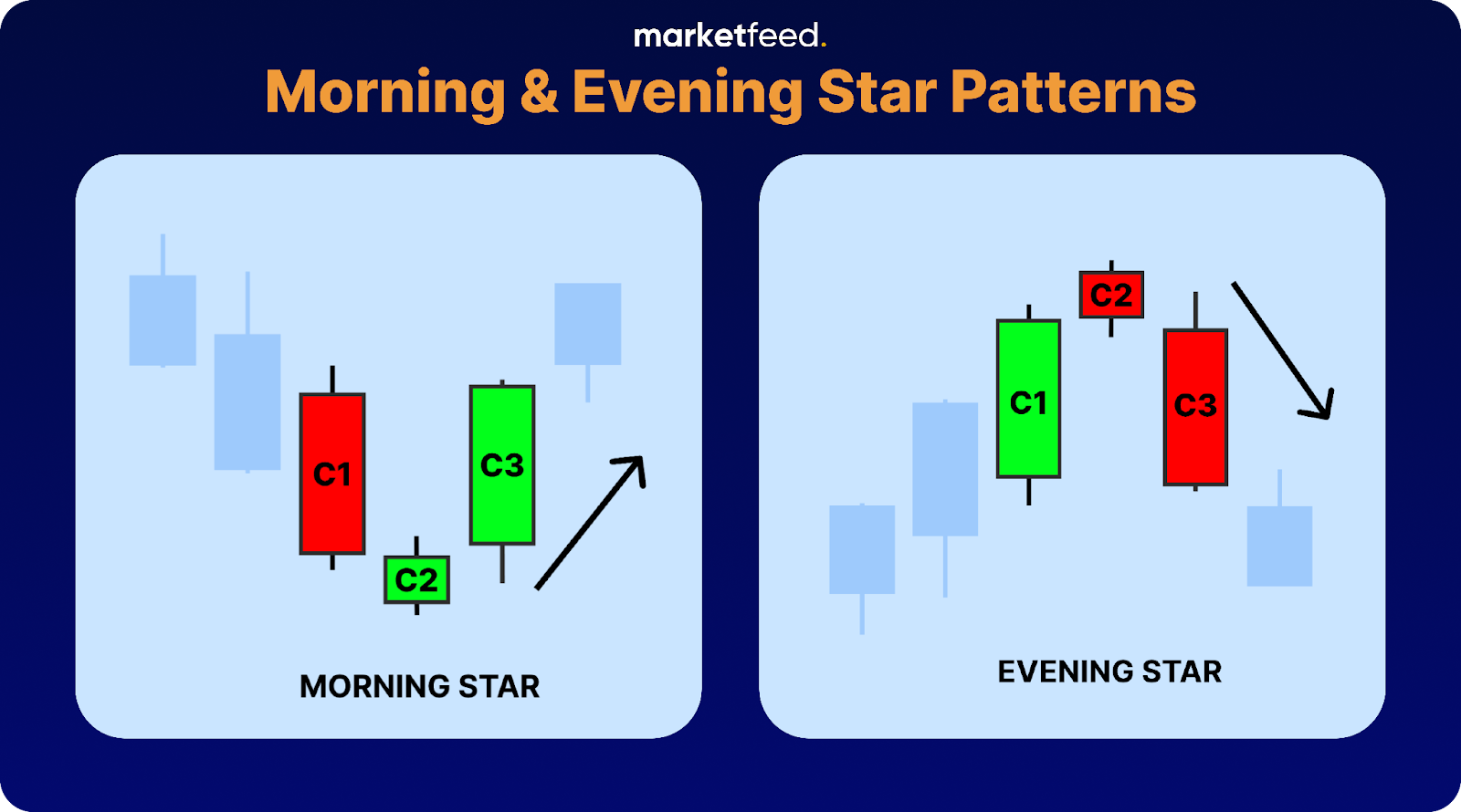
A morning star pattern appears during a downtrend and consists of three candles. The first candle is a large bearish (red) candle, indicating the prevailing downtrend. The second candle is a smaller candle with a small body that may be bullish or bearish. This candle represents indecision in the market. The third candle is a large bullish (green) candle that closes near or above the midpoint of the first candle. This pattern suggests that the selling pressure is diminishing, and a potential trend reversal toward an upward move could occur. Traders interpret the morning star pattern as a bullish signal.
On the other hand, an evening star pattern appears during an uptrend and also consists of three candles. The first candle is a large bullish (green) candle, indicating the prevailing uptrend. The second candle is a smaller candle with a small body that may be bullish or bearish. This candle represents indecision in the market. The third candle is a large bearish (red) candle that closes near or below the midpoint of the first candle. This pattern suggests that the buying pressure is diminishing, and a potential trend reversal toward a downward move could occur. Traders interpret the evening star pattern as a bearish signal.
In conclusion, reading candlestick charts is not just about understanding the price and volume data. These candles provide insights into the underlying psychology and market sentiments. Identifying patterns and taking the right action at the right time can only get better with time and practice. Make sure to practice identifying patterns on historic charts to get your game on for actual trading.